
If it wasn’t already crystal clear, the results of the weekly Global Recovery Monitor surveys continue to demonstrate that corporate treasurers’ primary concern during the COVID-19 pandemic is liquidity—how much cash is available, where is it located, what debt payment requirements are on the horizon, what additional funding sources exist, and more.
At the same time, leadership has put the onus on the treasury team to report daily, up-to-date liquidity data, causing many corporate treasury teams to rethink and reconfigure reporting processes to create robust custom dashboards.
In a recent GTreasury webinar, panelist, Priya Kurian, AVP of Canadian Tire Corporation, LLC, put it this way, “We took the time at the beginning of this crisis to revamp a system that was centered around actualizing monthly and looking at macro shifts, to one where we could see how things are being impacted on a daily basis. We built out a number of dashboards in our GTreasury system and senior management is now used to getting a number of the reports from the system daily.”
Fortunately, for companies using a treasury management system, the liquidity and debt data is all readily available. But the raw data requires interpretation and analysis to draw valid conclusions. Converting the raw data into custom visual representations of cash, accounts receivable, funding and debt positions simplifies daily reporting. The resulting dashboards provide snapshot views of the daily liquidity status to help the treasury team and leadership make smarter business decisions before any situation becomes critical.
What data should you include in your dashboard?
The quick answer – It depends on the unique needs of your company. The first step is to determine what data points are important to track daily, and then determine the best way to snapshot that data into an easily understood chart or graph. Once you have the individual elements created, you can aggregate them into comprehensive dashboards to present the information that matters most. You may need one dashboard for your leadership team and another for the treasury team with more in-depth information. Although your company’s dashboards will be unique to your requirements, a few recommended dashboard elements are shown and described below.
GTreasury is here to help.
A treasury management system can streamline many of the labor-intensive tasks outlined in these recommendations.
For most treasury teams, dashboard elements center on cash, funding sources and debt obligations.
Cash
During times of crisis, treasury teams need to have both transparency into their current liquidity situation and accurate forecasts to know how much cash they can expect to have in the short term to weather the storm. Dashboard elements showing where cash is held, and cash increases or decreases over time by currency, region or bank, make it easy to spot trends that require action. When needed, additional detail is available by drilling down in the charts or graphs.
Cash Balances Over Time
A basic view of cash availability over time is based on current company activity. In this example, if the company stays the current course, the available cash will decrease significantly in just 4 weeks. This type of view can make it clear that decisions must be made to shore up the cash position.

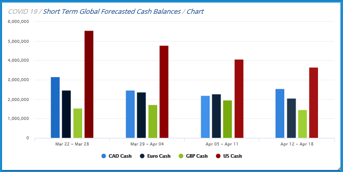
Cash Balances by Currency Over Time
Global companies will have cash and debt in different currencies. In this chart, the company is headquartered in the U.S. with subsidiaries in three other regions. Daily updates to the graph will show if a certain region is trending too low on cash. The quick visual of the developing situation will allow the team to determine the best course of action – whether to fund the struggling region with an intercompany loan or take on additional debt – before the situation becomes critical.
Accounts Receivable
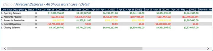
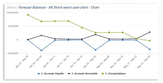
One of the main take-aways from the Global Crisis Monitor surveys is the consistent negative outlook toward accounts receivable. Your company’s available cash will be strongly affected by your accounts receivable activity. Modeling cash against shocks to accounts receivable will help you plan ways to manage cash should your worst-case scenario come true. If, as in the model below, accounts payable are outpacing receivables, the cash balances will eventually dip below zero. A daily view of your company’s accounts receivable trend allows leadership to take steps to avoid that situation.
Funding Sources
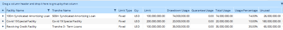
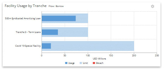
Available funding sources is another essential data point to monitor as the financial uncertainty of COVID-19 continues. If receivables slow down and revenues aren’t meeting projections, how much funding is available in existing facilities to meet company obligations? A graph like the one shown below shows the total value of the facility, and the amount already accessed. Treasury and leadership can use this view to plan where to draw additional funds if needed for working capital needs, capex or short-term capital requirements. On the other hand, if facilities are near 100 percent, decisions need to be made whether to seek additional sources of funding.
Facility Usage and Availability
Debt Obligations
Keeping a close eye on debt obligations in relation to your available cash is more important than ever during this period of financial disruption. Graphical views of timing and impact of debt payments, maturity dates, covenant exposures and refinancing requirements can give your team and leadership vital information for short-term and longer-term planning.
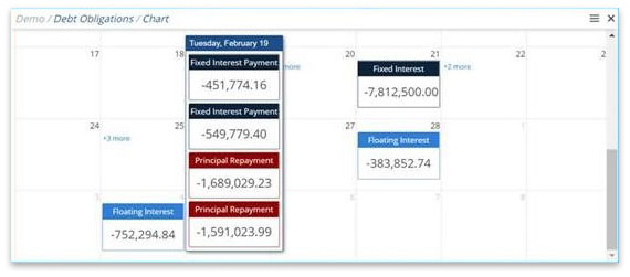
Debt Payments Calendar
Start with a basic, interactive calendar showing all your upcoming interest payments and principal repayment obligations in one place. You can set your view to be weekly, monthly or quarterly to provide you with the best window for your company’s planning needs. Users can drill down from the entries to learn more about individual transactions. The calendar view keeps the team on the same page about when cash is needed to make larger payments.
Debt Maturity Timeframes
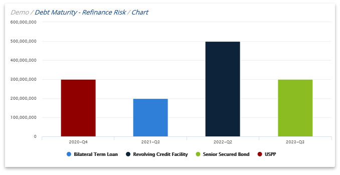
Tracking debt maturity is essential and a graph like this will most certainly be part of any dashboard you build. Debt obligations that are maturing in the short term may need to be replaced, which means sources of funding will need to be identified at advantageous rates. Or, if some longer-term debt carries a higher interest rate while rates are as low as they are right now, you probably want to consider refinancing that debt as well. This chart allows treasury teams to quickly identify where refinancing planning should be concentrated to provide cash availability and mitigate risk. Again, you will need to determine the time frame that makes the most sense for your company.
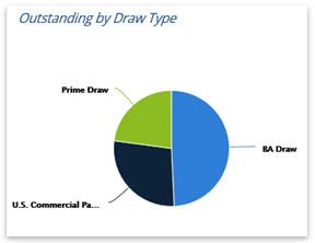
Outstanding Debt by Draw Type
A pie graph like this one can show your exposure to counterparty/concentration risks. For example, if a significant portion of your funding is with a particular bank, and that bank goes under, you will have to find the funding from another source to sustain your operations. In this chart, hovering over each section provides the balance held in each category. Drilling down provides additional detail. Understanding where funding is concentrated can help your team plan, optimize, and diversify if needed
Getting Started
For GTreasury users, robust dashboarding capability is integral to the system to help you visually chart or graph your treasury data in various ways. Other business intelligence tools like Microsoft’s Power BI, Tableau or Domo can provide the same type of visualizations once the data is imported into the BI system. Whatever tool you use to build your dashboard, take the time upfront to determine what information is most important for your leadership team. More importantly, determine how you want them to view it to facilitate intelligent business decisions while simplifying your reporting requirements.